css3阴影的应用
26 Sep 2017
Author:wuguanxi
一些定义
box-shadow口诀 :右 下 模 延 色 (inset)
box-shadow解析 :右(x轴偏移量) 下(y轴偏移量) 模(模糊半径) 延(延展半径) 色(颜色) (inset)
text-shadow口诀:右 下 模 色
text-shadow解析:右(x轴偏移量) 下(y轴偏移量) 模(模糊半径) 色(颜色)
MDN CSS box-shadowMDN CSS text-shadow
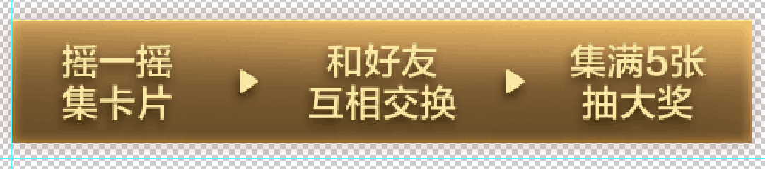
设计稿效果
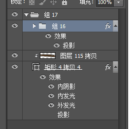
图层分析
代码实现
<div class="info_box" ></div>
  .info_box{
    width:500px;
    height:100px;
    background-color:#ffc975;
  }
内阴影
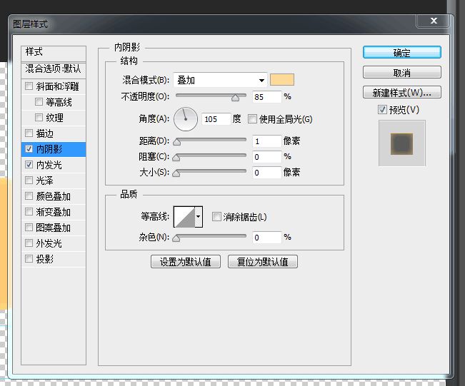
<div class="info_box inset-shadow" ></div>
  .info_box{
    width:500px;
    height:100px;
    background-color:#ffc975;
    margin:10px auto;
  }
  .inset-shadow{
    box-shadow:inset 0 1px 0   0   rgba(255,232,137,0.85);
  }
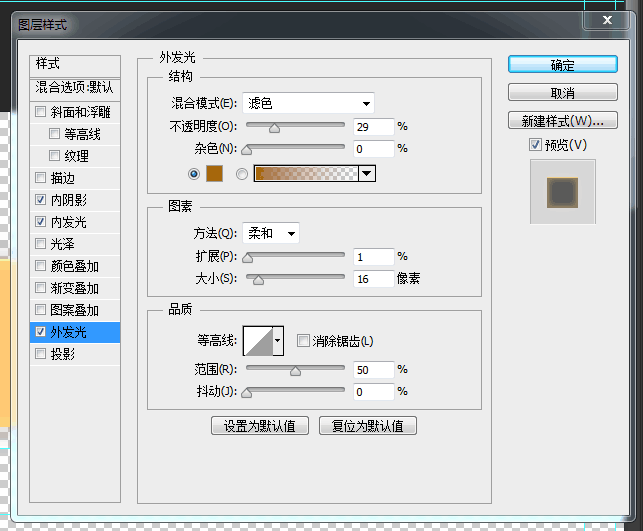
内发光
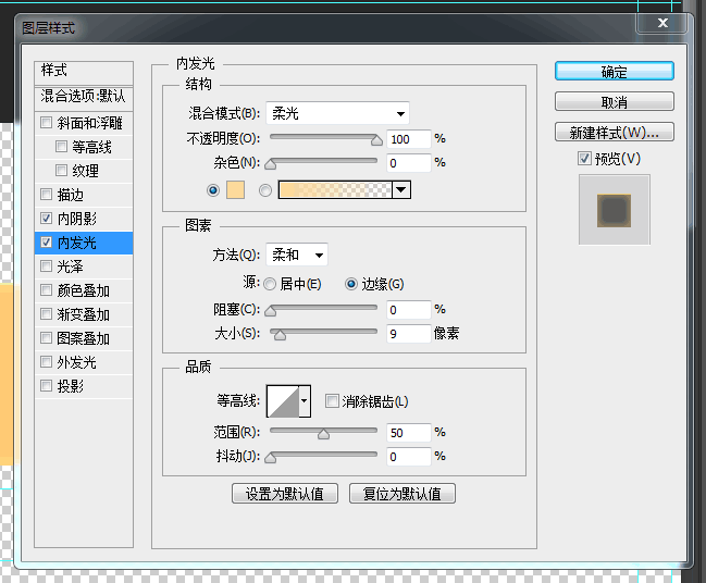
<div class="info_box inset-shadow_inset-light" ></div>
  .info_box{
    width:500px;
    height:100px;
    background-color:#ffc975;
    margin:10px auto;
  }
  .inset-shadow_inset-shadow{
    box-shadow:inset 0 1px 0   0   rgba(255,232,137,0.85),
               inset 0 0   40px 9px #fcd899;
  }
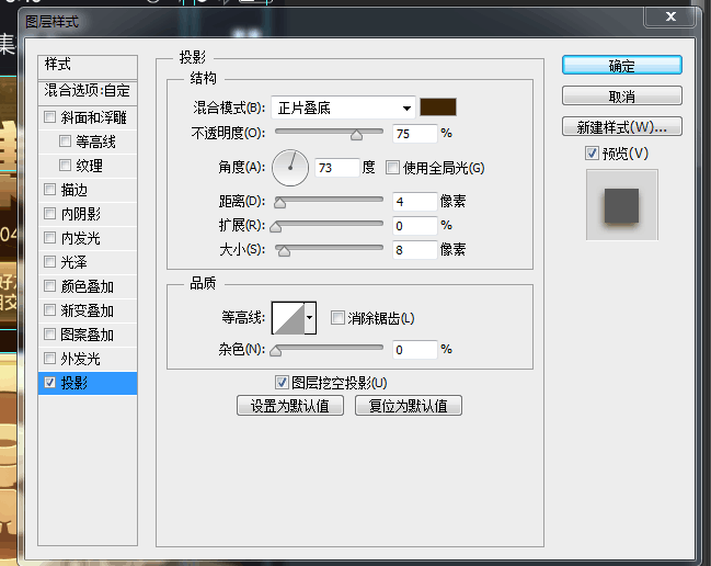
外发光
<div class="info_box inset-shadow_inset-light_out-light" ></div>
  .info_box{
    width:500px;
    height:100px;
    background-color:#ffc975;
    margin:10px auto;
  }
  .inset-shadow_inset-shadow_out-light{
    box-shadow:inset 0 1px 0   0   rgba(255,232,137,0.85),
               inset 0 0   40px 9px #fcd899,
                     0 0   40px 16px rgba(165,105,10,0.29);
  }
文字阴影
<div class="info_box inset-shadow_inset-light_out-light" ></div>
  .info_box{
    width:500px;
    height:100px;
    background-color:#ffc975;
    margin:10px auto;
    line-height: 100px;
    text-align: center;
    color:#f6e7a2;
    font-size: 60px;
  }
  .inset-shadow_inset-shadow_out-light{
    box-shadow:inset 0 1px 0   0   rgba(255,232,137,0.85),
               inset 0 0   40px 9px #fcd899,
                     0 0   40px 16px rgba(165,105,10,0.29);
  }
  .text-shadow{
    text-shadow:-3px 4px 8px rgba(67,39,3,0.75);
  }
文字阴影
尝试背景渐变

<div class="info_box inset-shadow_inset-light_out-light text-shadow" ></div>
  .info_box{
    width:500px;
    height:100px;
    background-color:#ffc975;
    margin:10px auto;
    line-height: 100px;
    text-align: center;
    color:#f6e7a2;
    font-size: 60px;
  }
  .inset-shadow_inset-shadow_out-light{
    box-shadow:inset 0 1px 0   0   rgba(255,232,137,0.85),
               inset 0 0   40px 9px #fcd899,
                     0 0   40px 16px rgba(165,105,10,0.29);
  }
  .text-shadow{
    text-shadow:-3px 4px 8px rgba(67,39,3,0.75);
  }
  .linear-gradient{
    background-image: linear-gradient(2deg, rgba(0,0,0,.1), #483015 60%, rgba(255,255,255,.1));
  }
文字阴影
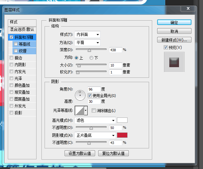
斜面浮雕
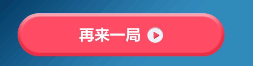
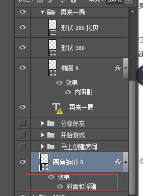
  <div class="btn" >再来一局</div>
  <div class="btn relief-t" >再来一局</div>
  <div class="btn relief-b" >再来一局</div>
  <div class="btn relief" >再来一局</div>
  .btn{
    width: 280px;
    height: 60px;
    margin: 10px auto;
    display: flex;
    justify-content:center;
    align-items:center;
    border-radius: 3em;
    font-size: 20px;
    background-color: #ff4a64;
    color:#fff;
  }
  .relief-t{
    box-shadow: inset 0 -4px 3px 3px rgba(0,0,0,0.3)
  }
  .relief-b{
    box-shadow: inset 0 4px 3px 3px rgba(255,255,255,0.3)
  }
  .relief{
    box-shadow: inset 0 -4px 3px 3px rgba(0,0,0,0.3),
                inset 0 4px 3px 3px rgba(255,255,255,0.3)
  }
再来一局
再来一局
再来一局
再来一局
小结
box-shadow口诀 :右 下 模 延 色
text-shadow口诀:右 下 模 色